The following is a graph comparing 2017 temperatures (the red line) with 2018 temperatures (the blue line). Temperatures are in deg F from March 11 to April 10. This shows how much colder than last year this spring has been so far.
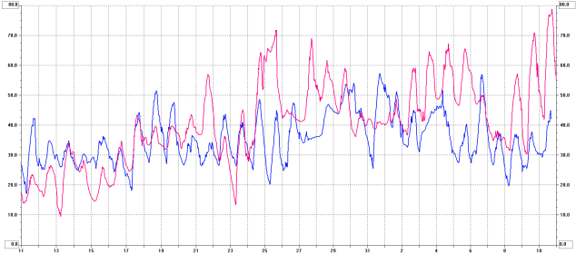
The following is a graph comparing 2017 temperatures (the red line) with 2018 temperatures (the blue line). Temperatures are in deg F from March 11 to April 10. This shows how much colder than last year this spring has been so far.

Celsius in VK.
LikeLike
Celsius in VK.
LikeLike
Hi Bill, I enjoy reading blog from Australia’s capital city Canberra, I have a keen interest in weather too. You may be interested to know on the east coast of Australia, last fortnight’s daytime temperatures were 10 degrees above the long term Autumn average. It’s Autumn now yet the daytime temps this past fortnight range from 26 to 32 degrees C, those temperatures are typical of Canberra’s summer weather.
I trust your recent cool spring weather will warm soon. 🙂
73, Andrew VK1AD
LikeLike
Andrew,
Was that 10 C or 10 F above normal? Here in the US we’re still using F for the most part.
LikeLike